Good design: more than making things pretty
Today a federal appeals court ruled that the U.S. government has an obligation to make money more accessible to people who are blind. It's easy for Americans to just assume money has to be a certain way. But we're pretty much alone in the world - out of 180 countries that use paper money - when it comes to making all denominations the same size and color.
As a result, it's near impossible for a person who is blind to know which bill he or she may be spending or receiving as change.
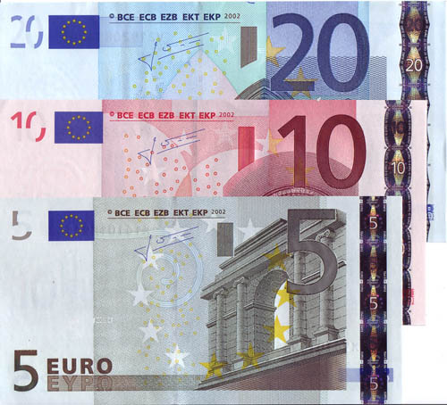
American money is ripe for redoing as an exercise in universal design. Canadian money features a handful of accessibility features, including tactile spots that work like Braille. Different denominations of Euros are different colors, and the bills increase in size as they increase in value. They're nice looking, too.
0 TrackBacks
Listed below are links to blogs that reference this entry: Good design: more than making things pretty.
TrackBack URL for this entry: http://www.davidkamerer.com/cgi-sys/cgiwrap/deanna/managed-mt/mt-tb.cgi/16

Leave a comment